Tuesday, March 30, 2021

Developing My Double Page Spread


 As with the other components of my magazine my double page spread lacked flare and creativity. Even though I understood and implemented most of the conventions of a double page spread on my draft I had not explored all the possibilities, which made my page look bleak and a turn off to read. So, I drew upon other black hair and beauty/skin magazines for inspiration and a foundation to build off of.


 I came across this double page spread from the Black Beauty and Hair magazine that I found appealing, particularly the way how the text framed the shape of the image. The text fills in the space of the image giving it a unique shape and placement that makes the story enticing to read. I also liked the format of the letter F in the story, as it draws the reader's focus in on the text and it helps to stand out since it is not the largest feature on the page. Furthermore, the miniature stories on the second page was a good use of space and an interesting addition on the double page spread. 


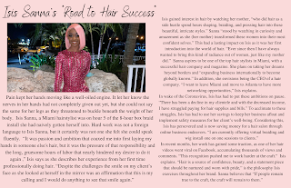
With these observations in mind I began formatting my double page spread by erasing the background of my main image and extending the picture so that Isis's full frame was in view.  I then began to work on the title of my story. During this process I began looking at magazines for inspirations in which I found this double page spread from Black Hair and Beauty helpful. I liked the contrast between the playful calligraphy the title is written in versus the basic font that was used beneath it to describe the purpose of the page. I also liked the way how the text was organized in columns instead of in paragraph form as I felt it added more layers to the details on the page. 


As I continued to work on my title I found a playful font like the one used in the article above that I liked and a basic script to write the subheading in. This contrast created a feminine and elegant look that I felt matched the aesthetic of my feature page. I then used Isis's body as a tool to divide the first page in half. I used this spaced as a guide in formatting the text into columns around her body, so that the story could naturally be easy on the eyes to read. I also incorporated the P in larger text box with a burgundy color to draw readers into the story, as well as framing the sides of the pages with a white line to create some contrast on the page and create a focus on the text boxes. I enlarged and bolded the last sentence of the story to emphasize the significance of the message in my model's "Road to Hair Success" story and also because it added some variety to the text. I was left with a lot of negative empty space at the bottom of the page that I decided to fill in what a puff piece of Isis's work that promoted and showcased her businesses like beauty magazines often do. 


I added a slab of color onto the page to create a divider between my feature story and the puff piece. I chose the orange color that I used on my content page to continue the color scheme and make my words and pictures stand out. 

                     
I added a puff piece on a curl set Isis did on a client with short hair and incorporated her contact information like I have seen other magazines do on their short stories.

I then added the pictures of Isis's work that I had captured a couple days prior by erasing it's background using the background eraser tool found in Canva. I then framed the pictures around the text and added the website link, issue date, and page numbers on the bottom of the page, which are typical magazine conventions in black hair and beauty/skin magazines. 
This is the final product.

Source of Information:
 Black Hair and Beauty Double Page Spread:
https://www.blackbeautyandhair.com/wp-content/uploads/2020/11/001-v1_BBH_DecJan21_LR-WEB.jpg

Friday, March 19, 2021

Developing Table of Contents: Images, Part 1

Kristie, one of my model. and I met up over the weekend to practice shots and hopefully capture some good pictures for my table of content page. These pictures were taken over the course of a weekend we spent together as she cleaned out her closet. When life gives you lemons you make lemonade! I took this as an opportunity to execute a photoshoot of sorts, with of course a fashion show in between. With her help we pieced together a variety of looks, ranging from a casual to high-end style, and experimented with different lighting and camera angles. One of the reason why I chose to do a black hair and beauty/skin magazine was because their photographs allowed for a lot of flexibility regarding colors, poses, models, hair, outfit, accessories, etc. I think this creative freedom is what drawn me to this magazine genre and what makes these hair and beauty magazines so appealing.

Although I took an assortment of pictures I am leaning more towards the last images as it's lighting is the most complementing of my model's skin of all the photos taken, which works in favor of my skin/beauty content. Her red nail color and black and gold attire are also enriched by the sunlight, and in combination with the gleam off her distressed locs by the sun I feel these photos captures the beauty/skin and hair content of my magazine best.


Location: Kristie's Backyard 
Outfit: Camouflaged pants & fur jacket
Hairstyle: Loose wave
Props: Sunglasses & Phone
Angle/Shot: Low angle, Mid-shot


Location: Bush behind Kristie's house 
Outfit: White tub dress, Head scarf
Props: Beige purse, Gold necklace, Gold rings, Sunglasses 
Hairstyle: Black straightened hair  
Angle/Shot: Mid-shot 


Location: In front of Kristie's house 
Outfit: Black tube dress, Cream sweater
Props: Gold hoop, Collage bag
Hairstyle: Black straightened hair
Angle/Shot: Full body & Mid-shot 


Location: Taxi
Outfit: Squared black shirt
Prop: Gold hoops, gold rings, gold bracelets, sunglasses 
Hairstyle: Distressed Locs 
Angle/Style: Low angle, Close-up


Thursday, March 18, 2021

Developing Table of Contents: Images, Part 2


Below are the photos of skincare products I took for the skincare section of my table of contents. Looking at content pages from other black hair and beauty/skin magazines I noticed that images of skincare products was a common feature on all pages, therefore I felt taking these pictures was a necessity for an authentic beauty/skin magazine. I chose the basic skin creams and oils I could find around my room to match the natural skincare information my cover page and content table promised coverage on.  As you can tell I played around with the lighting, angle, prop set up and background for my photos, but in the end, I decided to use the third picture as the lighting from the sun had increased the clarity and readability of the label and details of the creams and oils. Since I would eventually erase the background of the photo in Canva the mis-en-scene was irrelevant, as so was the props, as I could manually add them in Canva. In the end it all came down to lighting, which I got the best of during midday, when the sun was partially out.


Wednesday, March 17, 2021

Developing My Content Page


 Being that I altered the color scheme of my cover page from a monochromatic pink into bright festive colors like blue, yellow, green, and pink I had to rearrange my contents page to match my new theme. Additionally, my content page was basic and looked uncustomized, which is the complete opposite of  what a magazine's content page is supposed to look like. Since this basically meant that I had to scrap my entire content page I looked at other magazines for inspiration and as a basis to start building off of.

                                                                   I stumbled upon this content page from the Black Beauty and Hair magazine. I found the layout of the page simple, but yet appealing which was what I was going for. Therefore, I structured the content information on the left side of the page in columns, with the page number, page title, and content information organized in the way that it was on the cover page.


I fitted the image on the right side of page, as it is formatted on the magazine's content page. However, as I went down lower on the page I began to integrate my style and preferences on the page. I put the skincare section on the right side of the page and the image on the left instead of following the order of the magazine's content page because I felt that it added some variety to the page. After analyzing the magazine's content page I realized that I had forgotten essential conventions such as the publication date, website, and photography credits on my previous draft. I made sure to add these details on my current content page, as well a variety of pictures that correlates my content and adds character to the page.


I was not satisfied with the content page as I felt it  lacked the feeling of liveness I am going for. Hence, I added a cool shade of orange to the background of the second image and added another text circle of a similar color and size. This increased the content page appeal and enrich the page with color and shapes.


This is the final product.

Source of information:
Black Beauty and Hair Content Page:
https://www.blackbeautyandhair.com/wp-content/uploads/2020/11/001-v1_BBH_DecJan21_LR-WEB.jpg

Contents Page Draft


Thursday, March 11, 2021

Developing My Cover Page


Originally I had planned on sticking with this design for my cover page, but upon further research of magazine conventions seen in black hair and beauty/skin publications, like Essence, Ebony, and Black Beauty & Hair I decided that my draft did not exactly meet the standards of my magazine genre. For one I felt the cover looked washed out and empty, which is the exact opposite of black hair and beauty/skin magazines. So I partially scraped the cover page, only leaving behind the taglines, masthead, main image, anchor text, cover lines, buzz words, and barcode.


The masthead was bleak and camouflaged, and while I tried to do a monochromatic look for the main image the pink on-pink background had a camouflage effect as well. So therefore, I replaced the main image's background with the original back drop and filled "Lux" in with a neon green color to draw attention to the masthead. I also brightened the blues and yellows into a neon color to brighten the page.


At this point the cover had an excess amount of free space along the taglines and cover lines that made the page looked barren. I referred  to my tagline and cover line research,  and found that the words were sparse compared to what is usually found in black hair and beauty/skin magazines, so I began to fill in the empty spaces with content. After filling in the empty space along the sides of the page with more taglines and cover lines the page still didn't appear visually appealing. I blurred the background of the main image so that the text on the page became easy to read and allows the image to become the center of attention. I also added and neon blue and green shadows behind the cover lines to add color to the page and make the title stand out. These slight changes made a huge difference in the appearance of my cover page as it looked more realistic and adheres to the conventions of magazines.