Friday, October 30, 2020

Survey Market Questions


Below are the marketing questions I created for my survey. These questions are meant to gauge readers interests and opinion on a few marketing points for my magazine. I am creating a hair and beauty magazine, but I have yet to form a concrete and idea of what I am doing. Therefore their feedback will help to me form a target group and focus the content of my magazine to execute an appealing design. 

      
 1. What is your gender? 

2. How old are you?

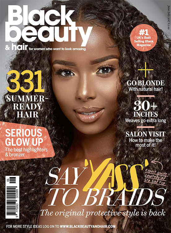
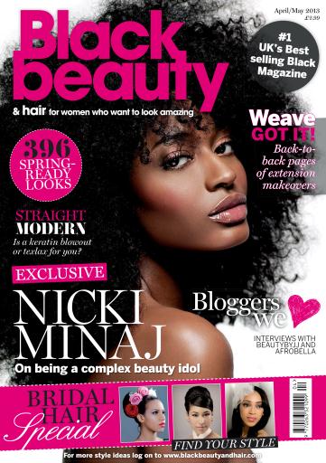
3. Which magazine title do you find the most appealing for a hair and beauty magazine?

4. Would you be interested in seeing hair and beauty information targeting both men and women, instead of solely women? 

5. What colors are most appealing to you?

6. What information would you like to see in my magazine? Please choose a maximum of 3.
7. What would you like to see on the front cover?

8. If you chose option B-D above what demographic would you be interested in seeing? 

9. For the front cover feature article what would you prefer to see?

10. What would you like the focus of the hair and beauty information to be on? Please choose at least 2.

Wednesday, October 28, 2020

My Target Market

 After researching gender and female representation in media I have formulated a target group that I would like my content to be geared towards. My demographic will be teenage African American females since they are under and misrepresented in the media. As a teenage African American female myself I have an understand of the things that will peak their interests and content they can also relate too. This gives me more insight and ideas on the stories and images I want to feature in my magazine. My skin and hair care tips will be catered to this market and will include photographs and articles that represent the interests of young African American girls who are into skin and hair care. Below are example of black beauty and hair magazines that I found appealing. 


Monday, October 26, 2020

Female Representation In Media


     Women are often sexualized in the media. There are pressured to conform to unideal beauty standards that will attract and entertain a specific audience, as well as to sell a product. They are painted as dependent, bitter, unintelligent, or manipulative characters. Magazines, albums, and movie covers showcase women wearing revealing outfits that accentuates their curves as they are doused in makeup, hair extension ,etc, to attract consumers to buy the album, movie, or magazine. Women in the music industry, primarily rap go through extreme lengths to create a distincts look and style. Rappers like Nicki Minaj and Megan the Stallion invest endless hours and finances into their hair, makeup, jewelry, and clothing to set themselves apart from the demeaning stereotypes women in the music industry are painted in. 

      However, there are prominent women in the media that rise to the occasion and makes a conscious effort to dispute misogynist stereotypes. Female musicians like Beyonce, Rihanna, and Billie Eilish disproves the stereotypes that a successful women has to dumb herself down, shrink her personality, or form a new identity to be accepted by the media. The media puts women in a box so that they are accepted by the world, but there are liberated women like these that shows young girls that they can make it while staying true to themselves. 


Beyonce on the cover page of Elle Magazine fully clothed, wearing limited makeup and accessories while modelling a piece from her clothing line. This is one example of how prominent women are presented in the media without being forced to conform into beauty standards. 


Friday, October 23, 2020

African American Representation In Media


Representation of African Americans in the media is scarce, Many mainstream magazines rarely feature African Americans, partially due to the fact that were created in times of prevailing racism and discrimination in the United States. Black magazines have changed this lack of African American representation. It focuses solely on publishing articles and commentary geared towards the African American market as well as images that promote representation of the community. There are about 200 different black magazine published today on various levels of popularity.  There are mostly popular in the United States and Canada, with black hair magazines being popular in Korea and hip-hop magazines in Russia and Japan. 

The first black magazine was the Negro Digest published in the 1940's by John Johnson, which was later renamed to Jet Magazine and created alongside Ebony Magazine. These magazines and the hundreds that came after it encouraged advertisers to support Black media and serves as an embodiment of black culture and entertainment in times when representation of African Americans is neglected by mainstream magazines and the media. 

Even though there are black magazines that aim to represent and cater to African Americans the general media lacks representation and what the little that is there is misrepresented.. The media often portrays people of color and women in negative and demeaning stereotypes. They are seen as violent criminals, the help, sexualized individuals, submissive character, etc. in the early 18th century media showcased African Americans as unintelligent, animalist, and ignorant characters. To say the least there is a serious lack of inclusion and representation of African Americans in empowering/flattering roles in the media. and frankly there is a need for it. In my magazine I plan on providing this representation to the African American demographic to give them their deserved respect and acknowledgement. 

Below are examples of media formats that provides African American representation.

Tuesday, October 20, 2020

Monday, October 19, 2020

Double- Page Spread Analysis


A double page spread, or a center spread is when one article is extended onto two pages. It seamlessly makes the article look poster like.. Below is my analysis of the information I interpreted from my research on double-page spread conventions.


Friday, October 16, 2020

Tuesday, October 13, 2020

My Content Page

  
     After researching common content page conventions and exploring different content page styles/layouts I have gained an idea of how I would like mine to look. Below are the content pages that have given me inspiration. 

Monday, October 12, 2020

Content Page Research


   The table of contents is presented on the first page of the magazine once it's opened. It is a list of all the topics in the publication and their corresponding page numbers. The table of contents can be laid out one one page, a two page spread, or on two pages intersected with advertisement. It includes font sizes, image arrangement, titles, and color schemes varies from magazine to magazine. Below is a list of common content page conventions.  
  • The title "Content" will be printed on the page in a large font, and is sometimes accompanied by the masthead title from the cover page.  
  •  The page number, magazine title, issue date,  web address and the editor's contact information will be found on the bottom of the page,  
  •  One main image will be included that indicates who or what the focus of the magazine is. Other smaller images which relates to the magazine's articles may also be included in the layout. 
  •  The title of the magazine's articles, also known as sub-headings will be organized into columns with its corresponding page number beside of it. 
  •  The subheadings appear on the content page in the same order that it appears in the magazine, so that information is easy to locate. 
  • The color scheme is simple but coordinates with the color scheme of the entire magazine 
  • Sublines is a synthesis of the details in each article to give the readers a description of what each article contains. They are typically located beneath the subheading and beside the page number in a smaller font.

The following are examples of different style/layouts of content pages. 

Friday, October 9, 2020

Using Camera Shot Composition


Framing: 

Framing is the placement, position, number, and relationships of the subject(s) in a scene. This is composition is purposeful in the way it is in filmed and how it is interpreted by the audience.  It can be produced through a variations of camera shots -such as a single shot or an insert shot- that is deemed fitting for the direction of the scene. This is a full shot image showcases the subject's joy on her birthday.  

Rule of Thirds: 

Rule of thirds is a 3x3 grid guide that the scene is framed in. This makes the shot aesthetically pleasing to look at since it follows the natural way in which the human eye looks for information. It provides a guide for the placement of the subject and its surrounding objects, which can be used add depth and meaning to a scene, keep the audience engaged in the film by peaking their curiosity, or pull the focus of the shot onto a specific detail. This grid can also help the audience easily locate the eyeline of the character and read their emotions. The image above displays this grid and how the subjects fit into the guide, to naturally display his anxiousness. 

dEPTH OF FIELD- DEEP FOCUS:

Depth of field is how sharp or blurry the area is around your object. A deep focus depth of field presents a clear and sharp image of the background and its subject. This allows for the photograph to be seen in it entirety in which the view can see the details of the background and the subject. The image above is focused on both the subject and its background, which fully displays the detail of the entire image. 

DEPTH OF FIELD- SHALLOW FOCUS:

A shallow focus depth of field is a sharp and clear of the subject against a blurred background. This draws the viewer attentions away from the background and solely on the subject making them the main focus of the image. This can be seen in the image above, as the turtle is now the center of attention. 

FOCUS pulls:

Focus pulls is a camera technique that changes the focus of the subject in an image, directing the viewer's attention. This used during dialogues, as the subject in focus transitions as each character takes turn speaking. This transition is seen in the two photographs, as the pineapple is sharpened and then blurred. 

Wednesday, October 7, 2020

Using Camera Shots


Establishing shot: 

The establishing shot is the introductory shot at the beginning of a scene. This shot is used to establish the settings geography and its time of day, and can also serve as a transition between scenes. This  is at a park late in the afternoon. 


                                                        Two-shot:


A two shot captures a clear image of two people in the same frame. This can be shown from various angles or shots, such as a mid-shot or low angle. This shot conveys the relationship between the two characters, whether it be romantic, hostile, platonic, etc. The image above shows tension and hostility between the two girls as they stare at each other with hard faces. 


 Over-the-Shoulder Shot:

An over-the shoulder shot  is taken over the shoulder of a person, and presents a clear image of the individual in front of them. This shot is typically used when filming a conversation between two people. Over the shoulder shots provides the audience with a perspective from both sides of the conversation. it can also capture a action, such as someone playing a game on their tablet like what is shown in the photo.


Point-of-view Shot:  A point of view shot is a first person point of view nto what a person is seeing or hearing.. This allows the audience a more insightful interpretation of the scene and the character. This images shows someone opening  their dresser draw through their eye's view.                                                                                                                                                         

Mid-shot:

The mid-shot is taken above the waist and ends above the head capturing the background. This a neutral shot, similar to the way in which we see others when we interact with them. It is used for dialogue scene to capture the character's body language and setting. In this mid-shot the baby is laughing and his body language is relaxed which shows that he is happy.


Close-Up shot:

The close-up shot is taken of the face from the neck or shoulder up, focusing on the person's facial expressions. They are used to express the character's thoughts or emotions and helps the audience empathize with the character. In this image the turtle wears an alert/shocked expression on his face to an incoming danger or his owner's strange behavior. 

Tuesday, October 6, 2020

Using Camera Angles


This blog post will explain and exemplify the purpose of the three commonly used camera angles by filmmakers. 

Low ANgle:

 The low angle is taken from ground level and pointed up to convey a subjects dominance/superiority. In this case the low angle amplifies the height of the rose to emphasize its beauty and enlarge its stature. This angle draws attention from the larger surrounding objects to make the rose the centerpiece of the image. 


High ANgle:  This angle is shot above the subject as if someone is looking down on the subject, which makes them appear vulnerable or inferior. As can be seen the size and power of the roses is greatly diminished at this angle and doesn't look as dominant as it did when taken from a high angle. 


Canted/dutch  Angle: 

Canted or Dutch angles are deliberately slanted to portray a state of disorientation, confusions, unease, etc seen through the eyes of the speaker. In this shot the flower is looked at in bewilderment through the eyes of the photographer, just as if someone was to be titled as they stared at the flower trying to figure out its species.


All images are original 

Friday, October 2, 2020

House Style Analysis/ Reflection


     After researching examples of different house styles I have made note of the some font types, spacing, word organization, and masthead position that I feel is flexible yet, fitting for my magazine. I have also jotted down some color schemes that I have found aesthetically pleasing and complementing to the house style.

Thursday, October 1, 2020

My House Style


   After researching multiple magazine covers I have a selected a few house styles that appeals to my interests. Below are my notes on the aspects of each magazine's house style that I like and would consider using a guide for creating my own house style. 

The masthead is a simple yet bold font with a twist. This paired with the vintage color scheme makes for an appealing look, but yet is minimalistics in its design.                                            
    
I like the font of the mast head used and that the color used does not take attention away from the main image, but enhances it. The organization of the cover and tag lines nicely frames and makes space for the main image while still remaining noticeable.The placement of the main image is well executed as it pieces together all the aspects of the magazine. One of my favorite details is the way in which the model's hair overlapped with the masthead. 


The fonts of the cover line are bold and exciting but not overbearing. Its placements does well at filling the space around the image, without looking cluttered . The simple/calm color scheme complements the business of the words. 
 

      The mast head and the color scheme is bold, fierce and sophisticated. This is further  emphasized by the font type and size of the cover lines and their placements.


Sources: 
https://tomandlorenzo.com/wp-content/uploads/2018/03/Gugu-Mbatha-Raw-A-Wrinle-in-Time-Vogue-UK-April-2018-Issue-Fashion-Valentino-Christian-Dior-Tom-Lorenzo-Site-1.jpg

https://blogger.googleusercontent.com/img/b/R29vZ2xl/AVvXsEjxwwpYnGev8nbbv8S2Kd6xE2hyLWybk48gCoW9x14RGPbjLKKmQtLabqKp7694vNo1ZALPs_U5fLcz1HIp3DIr5WaqDEt7Bvsa-0x4VGj0yPPEsl_u_u-ICelFZarXp4rCa3uAn14fzjQ/s500/Sunday-Fashion-Magazine.jpg

https://theknow.denverpost.com/wp-content/uploads/2020/09/Megan-Thee-Stallion-Time-100-Most-Influential-People-Cover-Epic-Long-Braid-Promo.jpg

https://thefader-res.cloudinary.com/private_images/w_1440,c_limit,f_auto,q_auto:best/F117-Cover-FNL_Megan_bcbkoc/norma-kamali-dress-alexander-wang-rings-the-shiny-squirrel-earrings.jpg