After researching examples of different house styles I have made note of the some font types, spacing, word organization, and masthead position that I feel is flexible yet, fitting for my magazine. I have also jotted down some color schemes that I have found aesthetically pleasing and complementing to the house style.
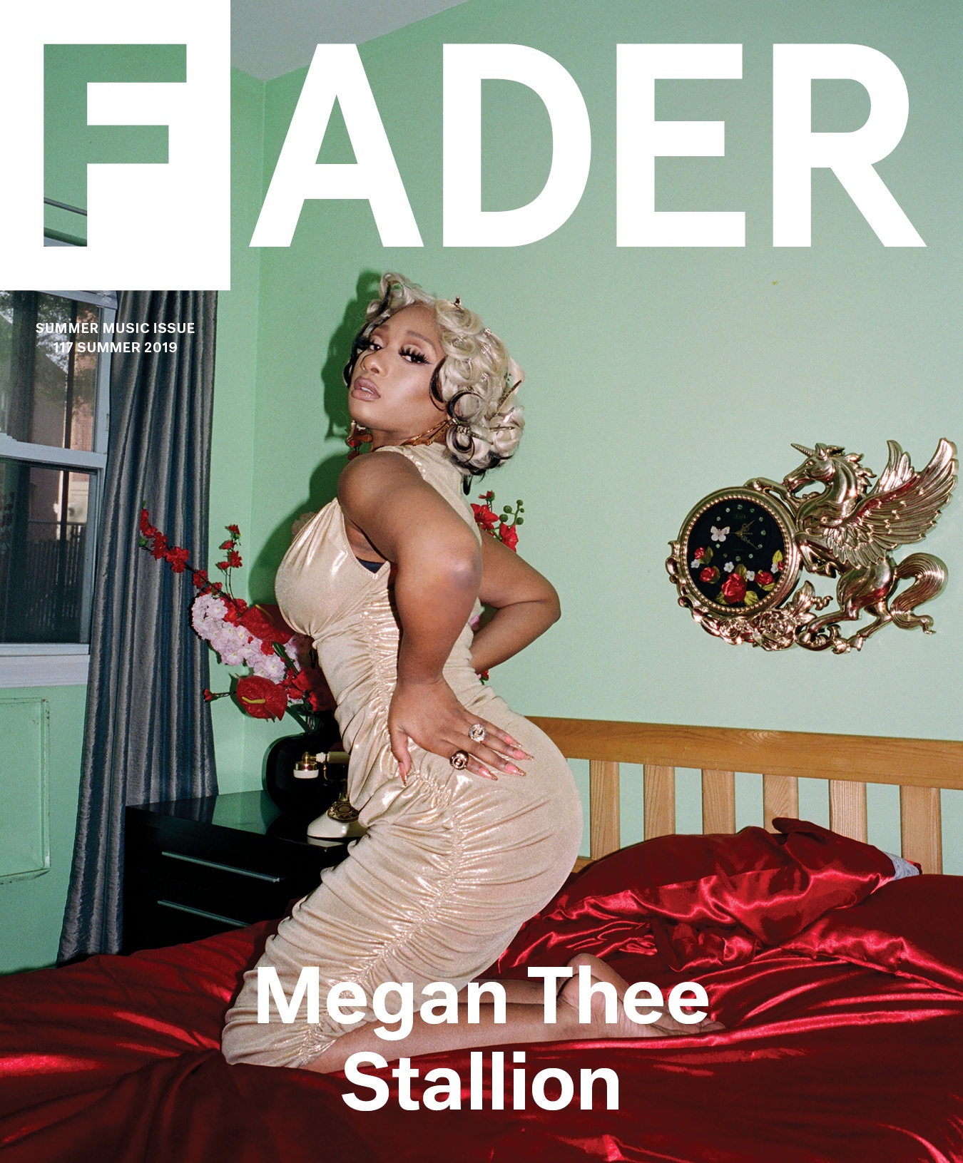
The Fader magazine is mostly barren of words, but the design of the masthead, specifically the F is a new look from what I have seen and goes into my collection of potential masthead formats. The vintage aesthetic of the main image is eye catching and brings life to the minimalistic feel of the cover. The placement of the description of the issue is discreet _ frankly almost invisible to the eye-_ but once noticed is an enhancer to the vintage aesthetic.

The TIme magazine has excellent conventions placement. The masthead font and placement makes it easy to spot despite its surrounding details. In comparison to the other magazines the masthead of the TIme had the largest spaces between the letters and in my opinion had the best look spacing wise The entire organization of the cover lines was neat and well portioned to the point where it was both aesthetically pleasing and easy to read. In addition the placement and selection of the main image was a key factor in tying everything together as it is appealing to eye, well-balanced with the coverlines and masthead, and offers a splash of uniqueness to the cover. The overlapping of the model's hair, the masthead, and tagline was one of favorite features of this magazine.

The Sunday magazine has a well-balance portion of various font styles, coverline placements, and font sizes. Even though this makes for a busy cover, it is also exciting and interesting to look at. The font styles of the coverlines are all potential fonts that I am considering adding to my drawing board as it a nice mixture of basic and fun styles. With this in mind I have also taken notice of the font sizes for each font style and in which sizes does certain fonts have the best look. In addition, the arrangement of the coverlines is fun but yet not overwhelming..

The color scheme of the Vogue magazine is bold, fierce, sophisticated, and most importantly visually pleasing. The bright, red color and font style of the masthead is one of my favorites so far and offers a lot of ideas for my own potential masthead.
Reference:
Fader magazine:
https://thefader-res.cloudinary.com/private_images/w_1440,c_limit,f_auto,q_auto:best/F117-Cover-FNL_Megan_bcbkoc/norma-kamali-dress-alexander-wang-rings-the-shiny-squirrel-earrings.jpg
Time magazine:
https://theknow.denverpost.com/wp-content/uploads/2020/09/Megan-Thee-Stallion-Time-100-Most-Influential-People-Cover-Epic-Long-Braid-Promo.jpg
Sunday magazine:
https://blogger.googleusercontent.com/img/b/R29vZ2xl/AVvXsEjxwwpYnGev8nbbv8S2Kd6xE2hyLWybk48gCoW9x14RGPbjLKKmQtLabqKp7694vNo1ZALPs_U5fLcz1HIp3DIr5WaqDEt7Bvsa-0x4VGj0yPPEsl_u_u-ICelFZarXp4rCa3uAn14fzjQ/s500/Sunday-Fashion-Magazine.jpg
Vogue magazine:
No comments:
Post a Comment