
According to the survey results a majority of my peers found pastel colors appealing, and I too like the soft and elegant look it gives off. Blush color palettes like the one on the left is an ideal choice for the color scheme of my magazine's cover page. It is simple, but yet not dull, which gives me space to add a bold/fierce main image, font styles, and colors without the cover appearing visually overwhelming. 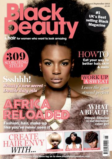
The brown and pink color scheme of this magazine reflects the idea of what I want to do and gives me inspiration on possible execution styles.

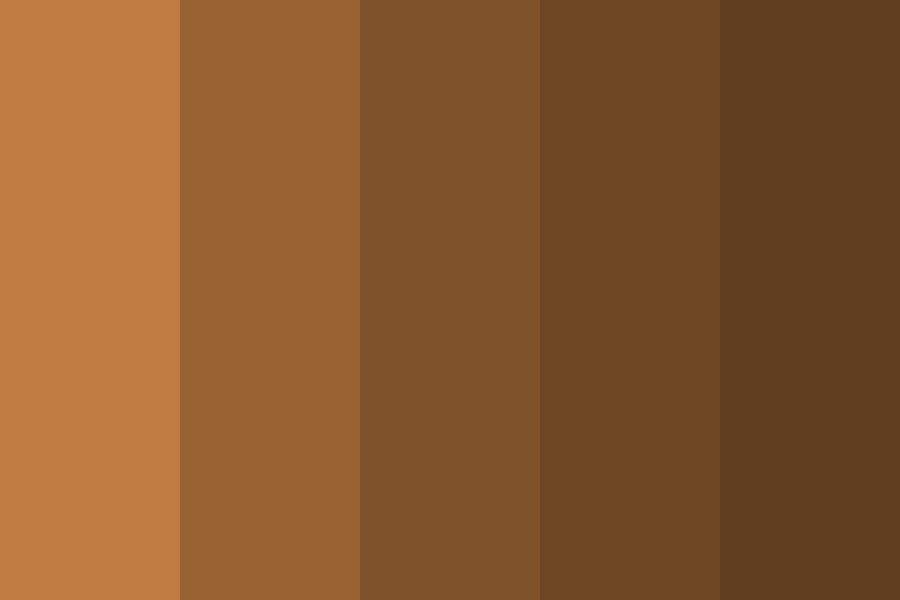
In addition to the pink/blush color scheme I intend to do I also want to include a mixture of neutral colors like brown and bright colors like the greens seen above.
Source:
https://www.pinterest.com/pin/21532904458188158/
https://covers.magazinecloner.com/covers/62290.jpg
http://paperheartdesign.com/blog/color-palette-spring-cherry-blossoms
https://www.color-hex.com/palettes/39649.png
No comments:
Post a Comment